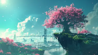
Why Consistency in Visual Design Matters for Player Immersion
18 August 2025
Imagine you're deep into a game, fully immersed in its world. You're exploring a lush forest when suddenly, a building appears with a wildly different art style. It’s not just a little different—it feels like it doesn’t belong in the game at all. For a split second, you're yanked out of the experience. That’s the power (or rather, the consequence) of inconsistent visual design. It might seem minor on the surface, but when you’re talking about player immersion—one of the golden tickets to a great gaming experience—consistency in visual design is absolutely crucial.
In this article, we’re diving into why keeping your game’s visual design consistent matters so much for player immersion. Whether you’re a game developer, an artist, or just a curious gamer, buckle up—we’re unpacking it all.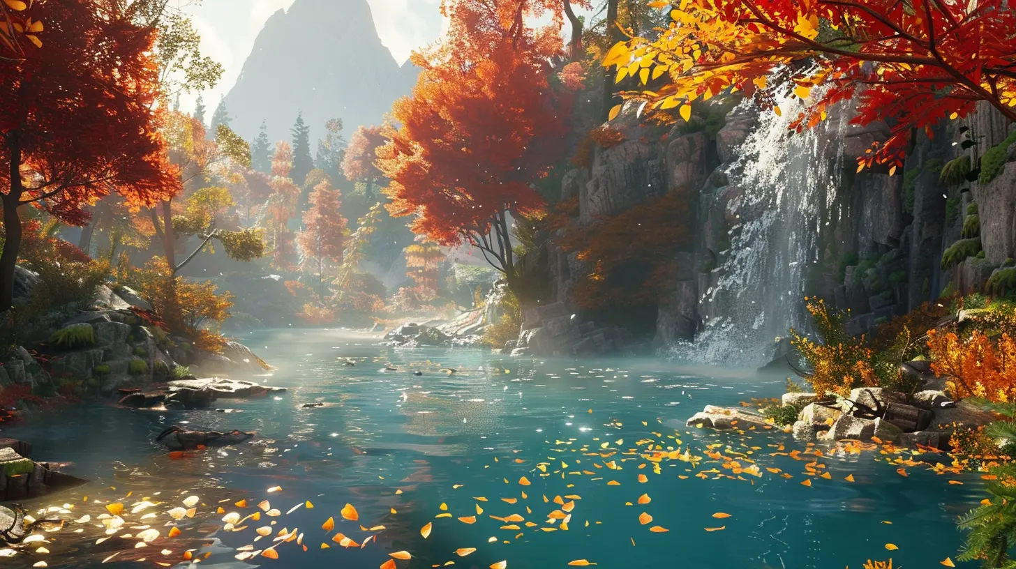
What Is Visual Design in Games?
Before we go any further, let’s quickly define what we mean by "visual design" in the context of games. Simply put, visual design refers to how a game looks—from its color palette and textures down to the tiniest details like button styles and font choices. It's the art direction, the user interface (UI), the character models, the environment, and even how animations flow. It’s everything your eyes absorb while playing.But here's the kicker: it’s not just about looking pretty. Visual design serves a bigger purpose—it creates a cohesive world that helps tell the game's story, guide players, and evoke emotions. And when done right, it pulls players in and makes them forget they're staring at a screen.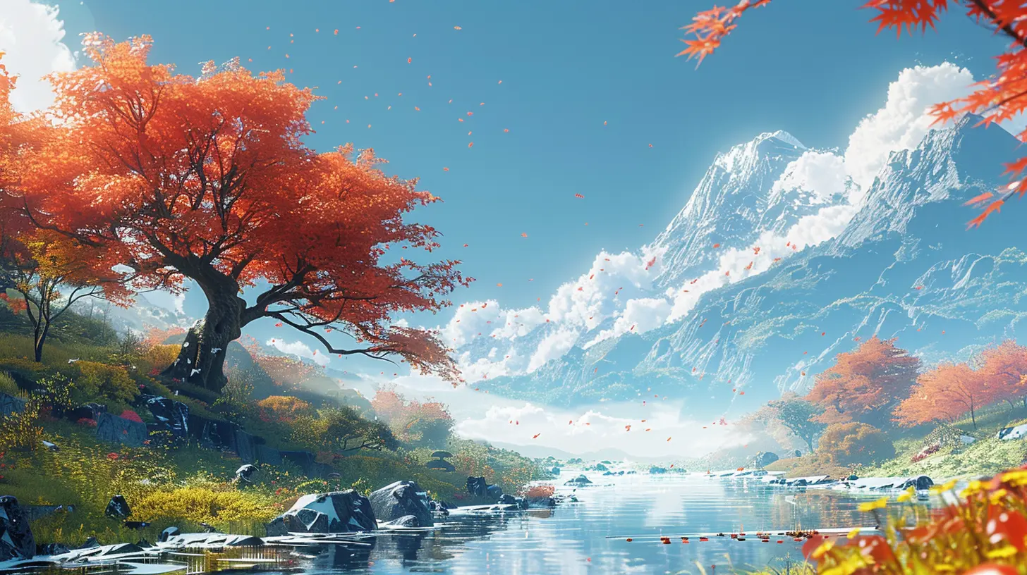
What Is Player Immersion, and Why Does It Matter?
Alright, let’s talk immersion. Think about those moments when you’re so absorbed in a game that hours slip by without you even noticing. That’s immersion. It’s when a game makes you feel like you’re part of its world—like the lines between reality and the game blur for a little while.Immersion is what separates good games from great ones. It’s what makes players come back for more. It’s what transforms an average experience into something unforgettable. But immersion isn’t just about a compelling story or addictive gameplay. It’s also about how well the game’s “world” feels real and convincing—and that’s where visual design comes in.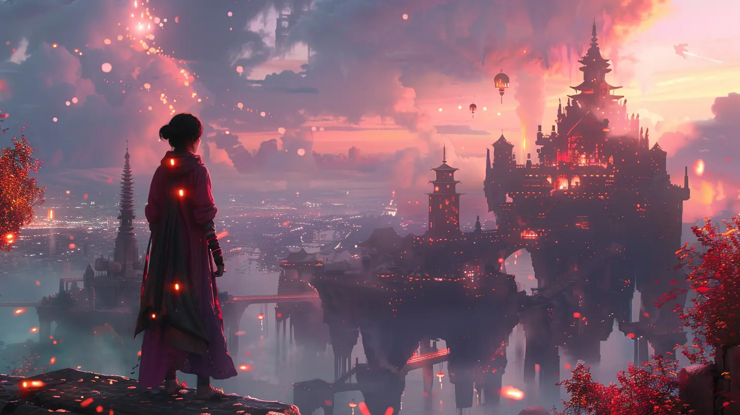
Why Consistency in Visual Design Is Key
Okay, so here’s the big question: why does consistency in visual design matter so much for player immersion? Let me break it down.1. It Keeps the World Believable
A game’s visual design is like the glue that holds its world together. When everything looks and feels like it belongs to the same universe, players can lose themselves in it. But the moment something feels out of place? The illusion cracks. It’s like watching a medieval fantasy movie where someone’s holding a smartphone—it takes you right out of the moment.For example, if you're playing a post-apocalyptic game with a gritty, muted aesthetic, and suddenly there’s a neon-pink vending machine covered in anime stickers, it creates a jarring disconnect. No matter how small the inconsistency is, it chips away at the believability of the game world.
Consistency doesn’t mean everything has to look the same—it just means everything should fit together in a way that feels intentional.
2. It Creates a Stronger Emotional Connection
Let’s face it: gamers are emotional creatures. We want to feel things—excitement, fear, joy, sadness, and everything in between. Consistent visual design is like an emotional translator—it tells us how to feel as we navigate the game.If a game’s visuals clash or feel fragmented, that emotional connection can wobble. Imagine playing a horror game where the environments feel dark and foreboding, but then you open the inventory screen, and it’s bright and cheerful, with cartoonish icons. It’s like your mind goes, “Wait, what? I thought I was supposed to feel scared!” That inconsistency breaks the mood and, by extension, the emotional connection.
3. It Helps with Intuitive Navigation
Here’s a fun fact: your brain hates guessing games when it’s trying to process unfamiliar environments. Inconsistent visual design can confuse players and make it harder to figure out what’s important. If players can’t tell which elements are interactive or which areas they’re supposed to explore, frustration sets in.Think of it like trying to follow road signs on a highway. If the signs suddenly switch to a completely different font or color halfway through, you’d be like, “Wait, am I still on the right road?” Consistent visual cues in a game help players feel confident and in control, which is a big part of staying immersed.
How to Nail Visual Consistency in Games
Now, I know what you might be thinking: “Cool, but how do you actually do consistent visual design?” Don’t worry—I got you. Here are a few practical tips:1. Establish a Style Guide
Ever heard the phrase "rules are meant to be broken"? Yeah, not here. A visual style guide is your ultimate rulebook—it defines the look and feel of your game. This includes color schemes, textures, lighting, fonts, and even animation styles. Having a style guide ensures everyone on your team is on the same page and that the visuals remain consistent throughout the game.2. Stick to a Cohesive Theme
Whether your game is set in a cyberpunk dystopia or a magical fairyland, pick a theme and commit to it. Every visual element in your game—from the UI to the weather effects—should support that theme.3. Iterate and Test
Sometimes, what looks good on paper doesn’t translate well in motion. Playtest your game and pay attention to whether the visuals feel cohesive to players. If beta testers are saying things like, “That part felt out of place” or “Something about the UI looks weird,” take it as an opportunity to refine.When Can You Break the Rules?
Look, I know I just preached about the importance of consistency, but here’s the thing: sometimes breaking the rules can work—but only if it’s intentional. Maybe you want to jar the player on purpose, like in a psychological horror game where the goal is to disorient them. Rule-breaking should be the exception, not the norm, and it should serve the narrative or gameplay in some way.Players Deserve a Seamless Experience
At the end of the day, gamers aren’t just looking for fun mechanics or beautiful graphics. We’re looking for worlds we can lose ourselves in. Consistent visual design isn’t just a "nice-to-have"—it’s essential for creating that sense of immersion.When developers pay attention to details like color harmony, art direction, and UI consistency, it shows. Players notice it, even if only subconsciously. And the result? They feel connected. They feel immersed. They feel like they’re part of the world you’ve created. And really, isn’t that what gaming is all about?
Final Thoughts
So, the next time you’re playing or creating a game, take a moment to appreciate how the visuals come together. Are they telling a cohesive story? Are they supporting the gameplay and emotions? If the answer’s yes, you’ve probably got yourself a game that’s primed to pull players in and keep them there.Consistency might sound like a boring word, but when it comes to visual design in games, it’s anything but. It’s one of the secret ingredients that turns a good game into something truly unforgettable.
all images in this post were generated using AI tools
Category:
Video Game GraphicsAuthor:

Tayla Warner
Discussion
rate this article
2 comments
Arden McCloud
Imagine a sock puppet mixed with a dragon—delightfully chaotic! Consistency in visual design keeps players grounded, preventing them from pondering the sock's backstory while battling fire-breathing lizards. Keep it cohesive, folks!
February 2, 2026 at 4:39 PM
Tayla Warner
Absolutely! Consistent visual design enhances immersion by allowing players to focus on gameplay rather than distracting details, like a sock's backstory. Cohesion keeps the experience engaging and accessible.
Stephanie McTiernan
Great article! Consistency in visual design really enhances player immersion by creating a cohesive world that feels believable. When players can engage with a unified aesthetic, it deepens their emotional connection to the game. I'm curious to see examples of games that excel in this area. Keep up the good work!
August 22, 2025 at 4:59 PM
Tayla Warner
Thank you for your thoughtful comment! Games like *Journey*, *Cuphead*, and *Hollow Knight* are excellent examples of strong visual consistency that enhance player immersion. I'm glad you enjoyed the article!